Case Study – Home Designs For Apartments Under 50 Square Meters
We are back with new ideas that breathe life into small apartments, this time under 50 square meters. These are solutions that make saving space a priority by various means available, especially by turning to tricks with a strong visual impact, so once you go in you find airy rooms, elegant and inviting alike. So here are some home designs for apartments under 50 square meters, in a series of four examples seen on the site Home-designing.com
The first example was a real challenge for two Polish interior designers who were hired to redesign an area of just 20 square meters inherited by a young couple. The two specialists relied on light colors, simple lines and wooden accents that manage to amplify the space beyond its physical limits. As expected, the storage spaces were all built-in, including the bed that goes up and down behind the glossy panels, leaving the central area of the apartment open to other uses. Modern accessories and patterns impart a youthful air to this small space, but otherwise open and welcoming.
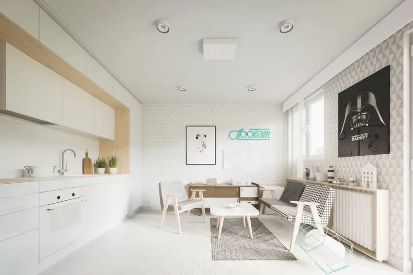
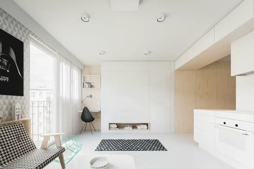
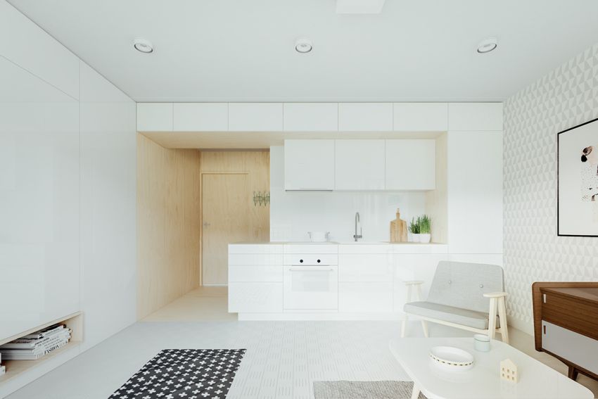
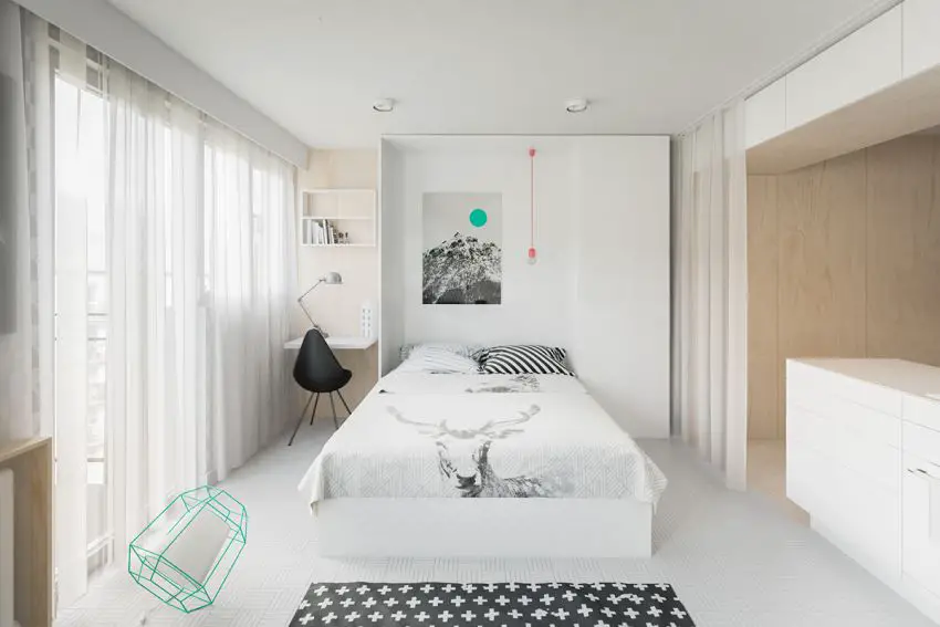
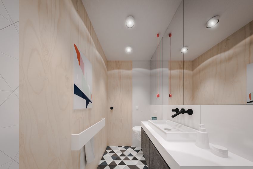
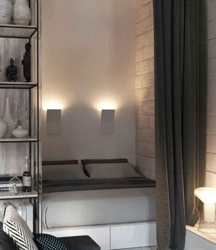
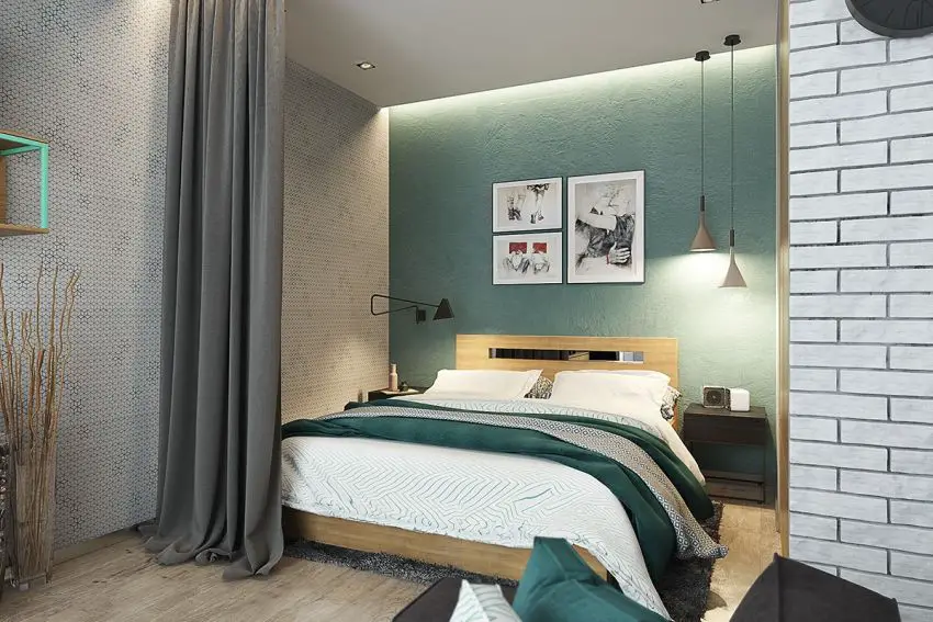
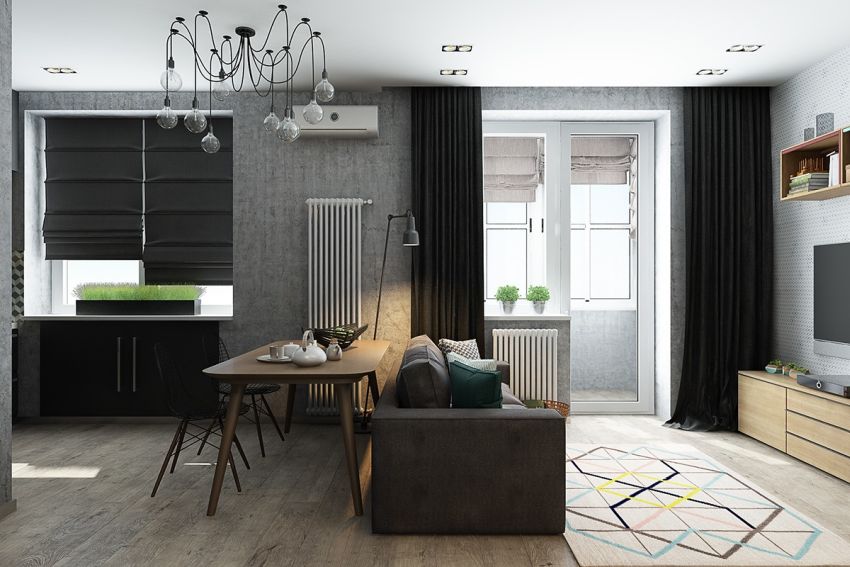
Again a dwelling spreading on 40 square meters, redesigned at the request of a young couple who wanted it divided into clearly defined sectors. The designers have managed to turn the apartment into a space with distinct areas in terms of aesthetics and function, but equally inserting elements that unite them. The bedroom received extra privacy by installing a curtain primarily meant to keep away the abundant natural light that enters the front window. Shades of gray dominate the interior, with plays of patterns on the walls and on the floor.
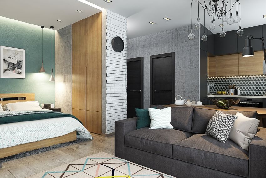
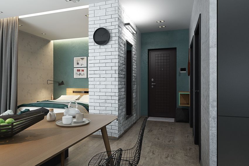
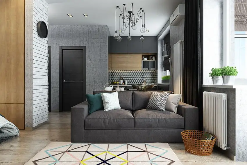
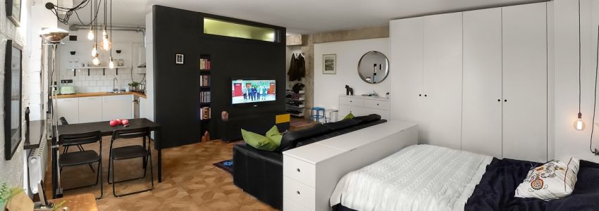
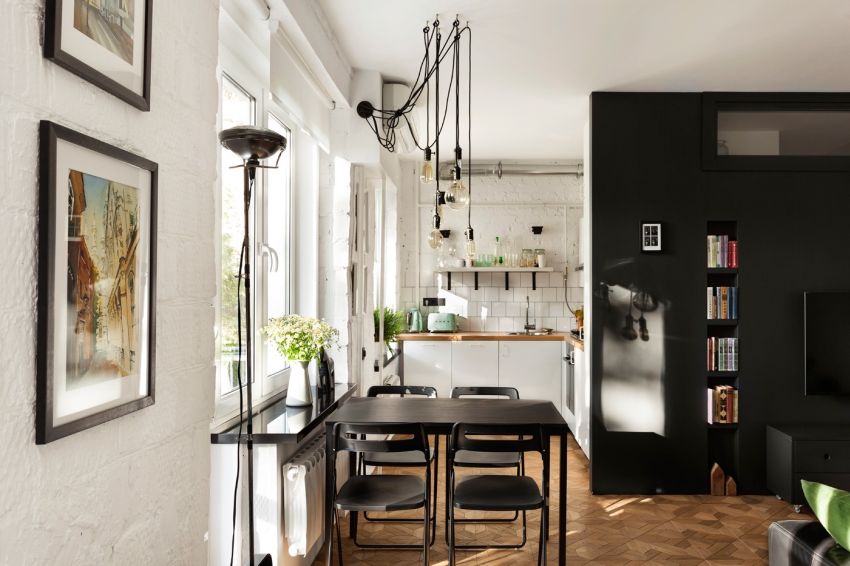
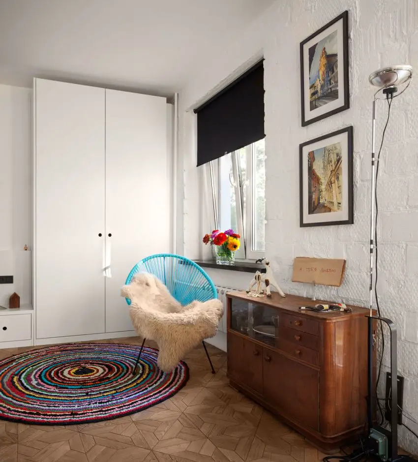
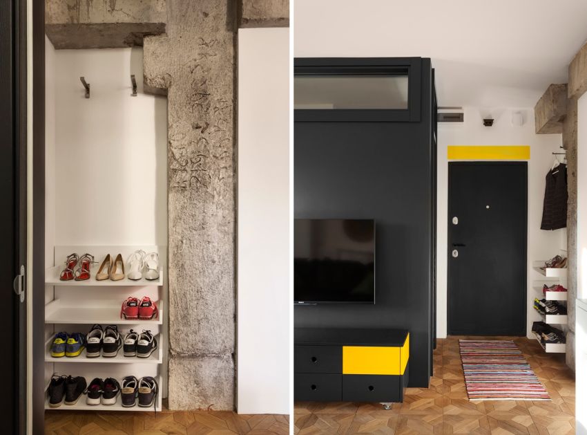
The third apartment lies on 43 square meters and is, in terms of interior design, the work of a Ukrainian designer, Nastya Antonyuk. The interior space is divided in two by a black structure that houses the bathroom, separating the kitchen and hallway from the living room and bedroom. An eclectic decor reflects the personality of the client, in a mix of vintage furniture, textiles and lighting systems in industrial style.
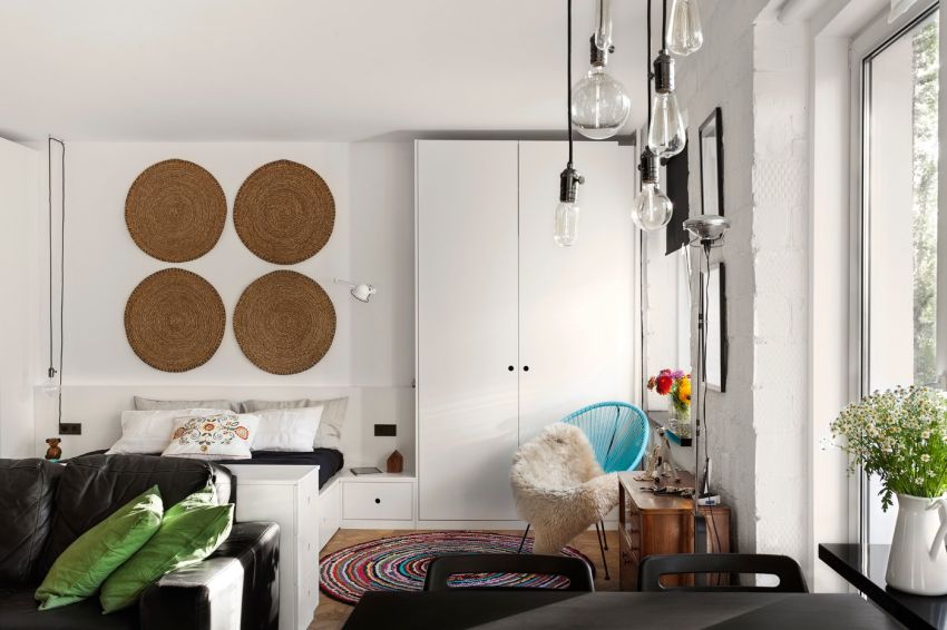
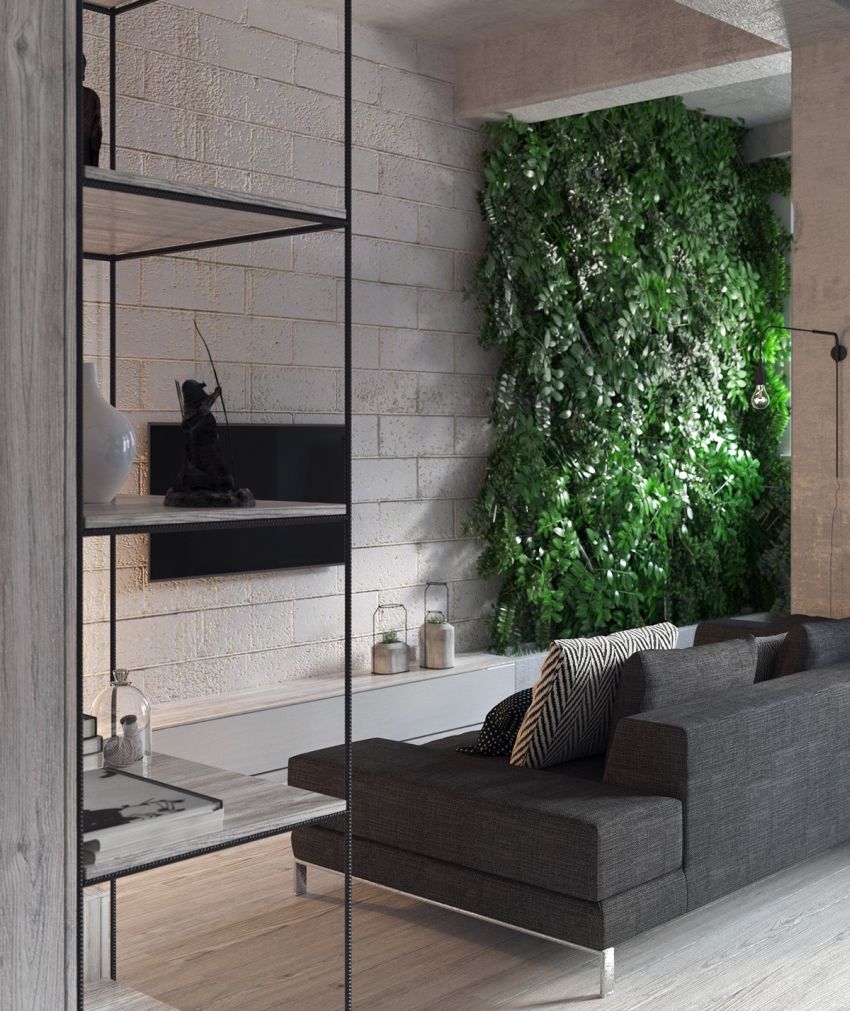
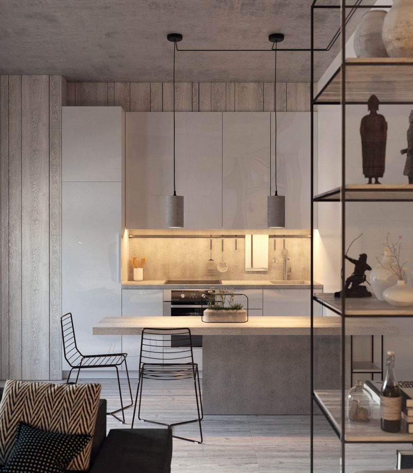
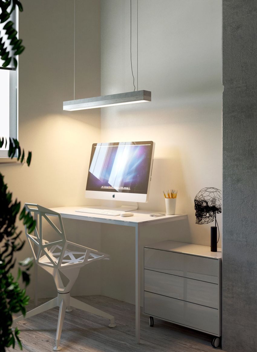
Lying on a similar surface, the last apartment combines affordable materials, such as cement and wood, in a minimalist space with organic insertions full of personality. Cement appears where you least expect, like shade lamps or flower pots, while the furniture exudes the idea of transparency, freeing space and allowing light to slip across the place freely.
