3 Apartment Renovation Ideas
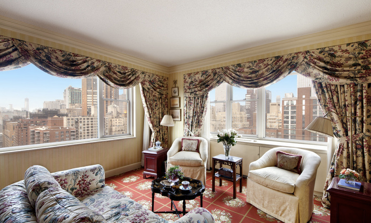
There’s probably nothing more suggestive in home design that a 1,000 word comparison, that is in pictures, between an initially inert space, lacking energy and personality, and the same place which metamorphoses into room full of vitality, elegance and color. And since pictures also speak for themselves, here are some of them showing some apartments that come back to life in a series of amazing transformations. So here are some illustrated apartment renovation ideas.
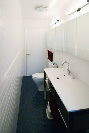
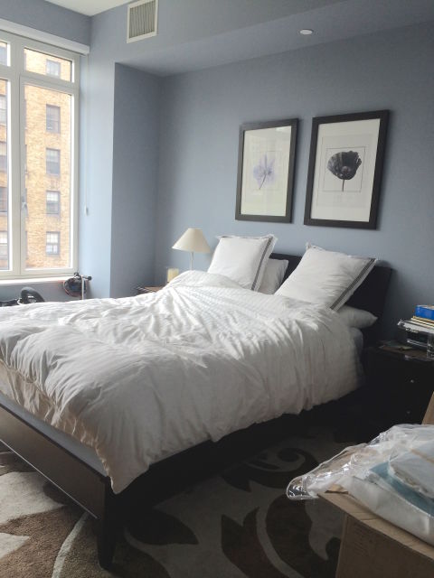
The first images come from an apartment in Queens, New York. The place in an old block of flats was in a bad shape, but the new owners were drawn to the many windows which allow natural light to flow in. as expected in renovations that concern small apartments, the designers thought of freeing up some space by removing some walls, especially in the living area. Even a one dark bathroom now shines thanks to a combination of modern design and artificial and natural light.
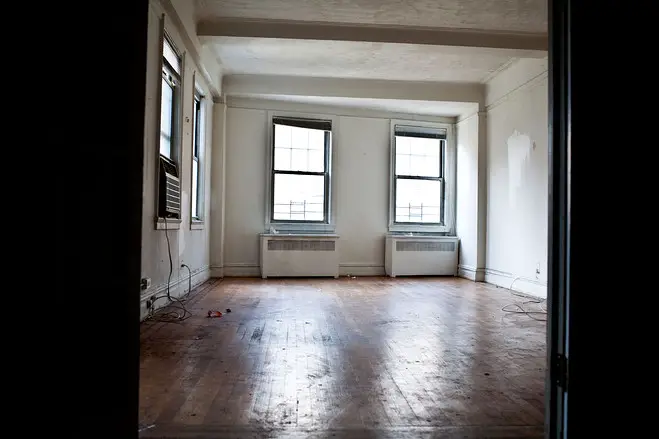
Apartment renovation ideas – the home in Queens
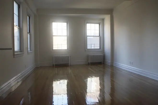
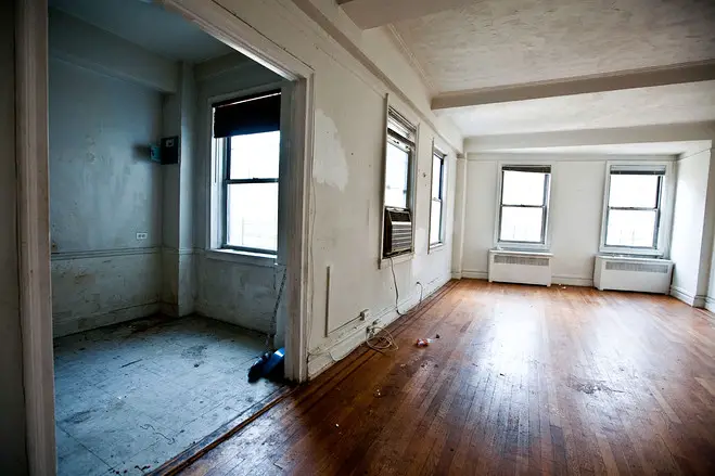
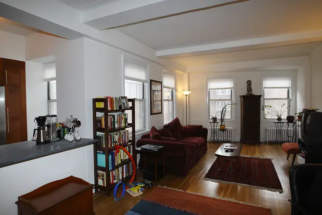
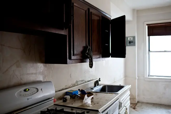
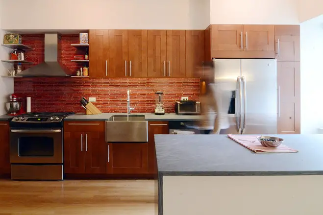
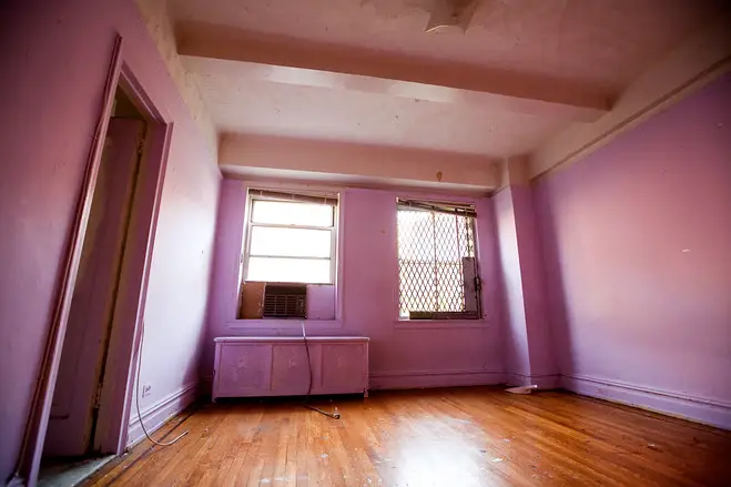
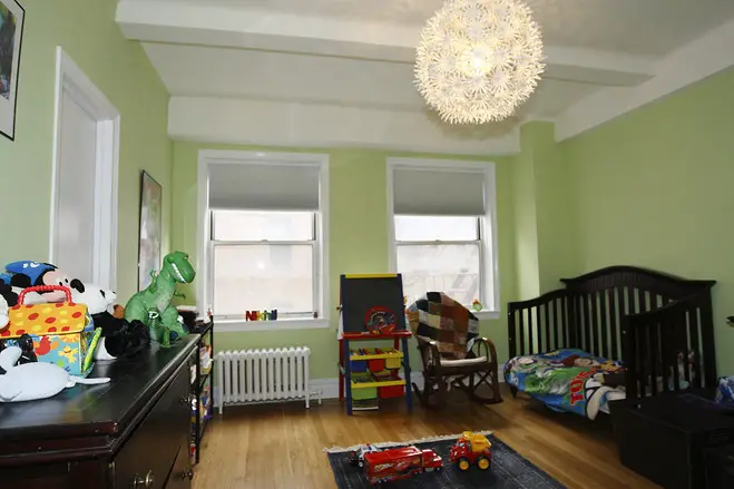
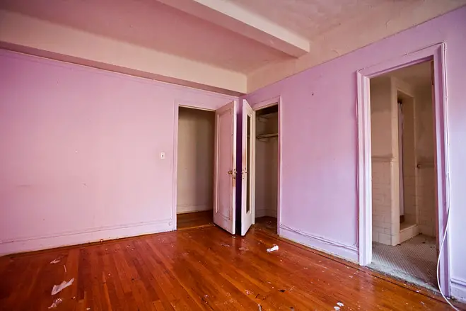
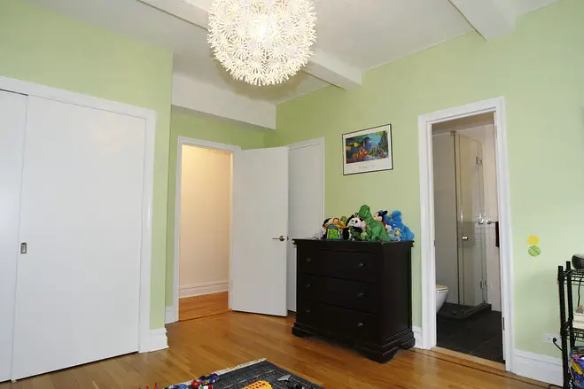
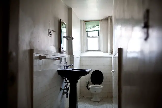
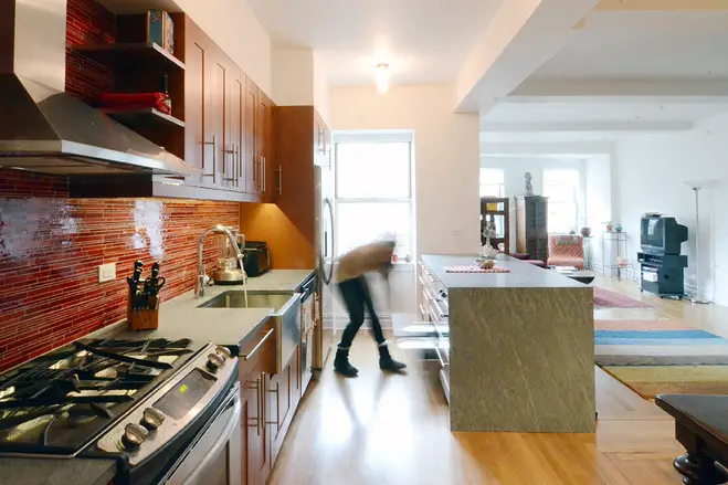
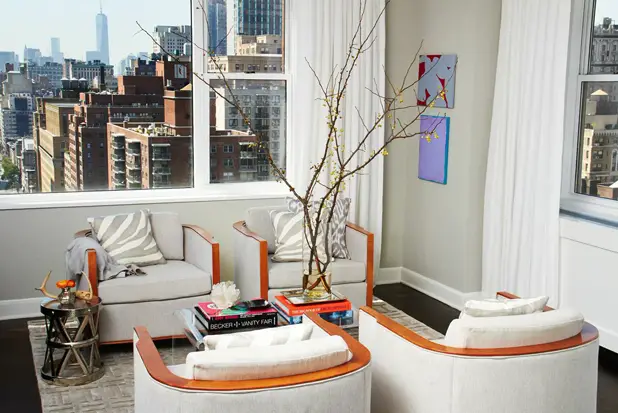
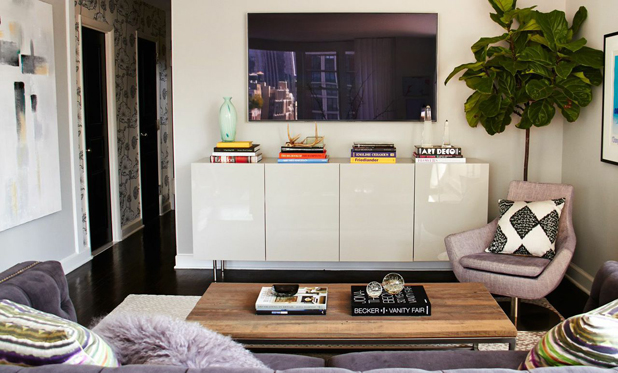
A little further, in Manhattan, a two bedroom apartment was given a modern look. The new place is now airy, a sophisticated space with an airy edge. It features an eclectic mix of modern and vintage that exude a comfortable and inviting atmosphere. A sitting area, with a cozy feel, was created in a corner of the apartment, opening it to beautiful views around. Walls were also torn down so the kitchen now joins the open space living area, making it easy for the hosts to cook dinner while entertaining guests. Originally there was square parquet flooring underneath the carpets. Installing dark wood floors was a great investment because it created a nice foundation for the light gray color palette featured throughout the space.
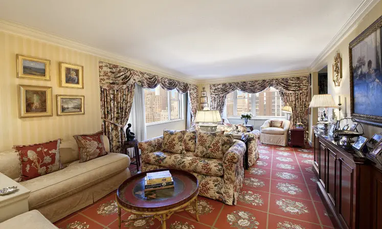
Apartment renovation ideas – an open and airy space
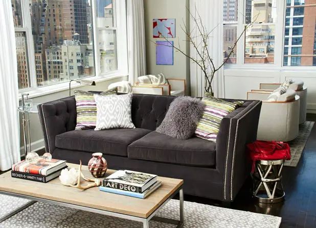
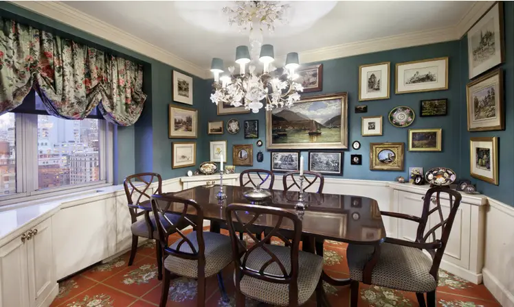
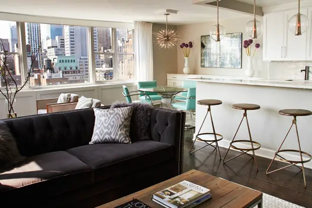
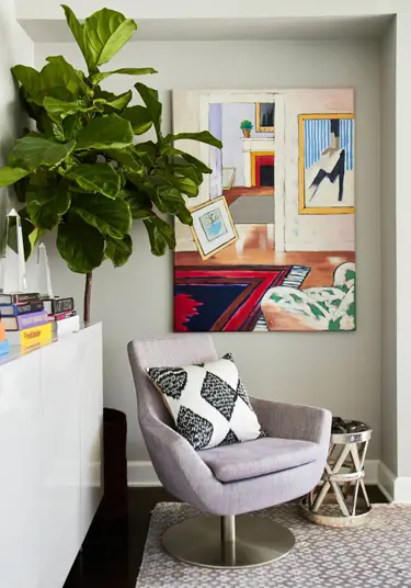
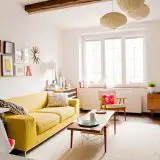
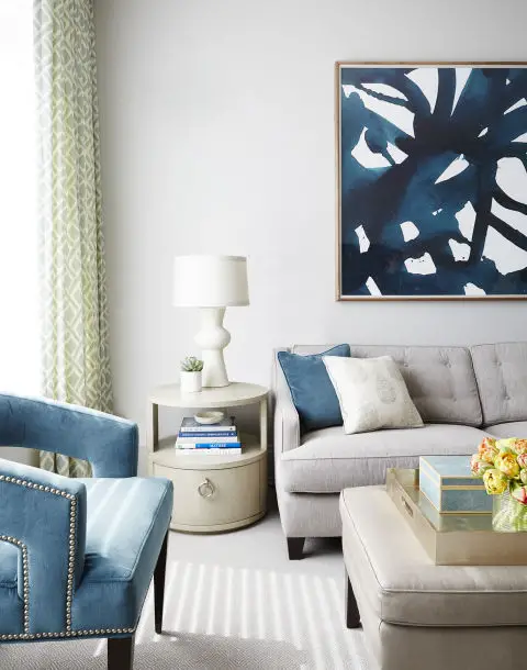
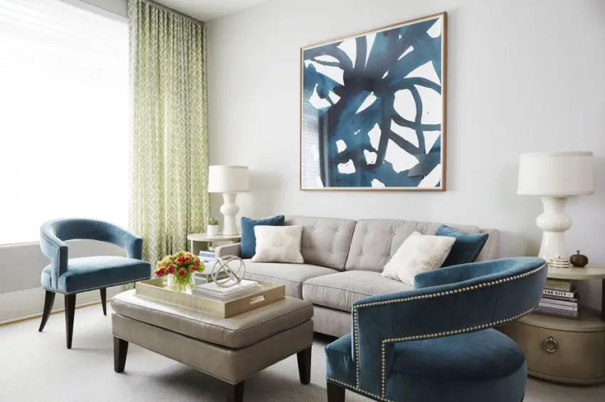
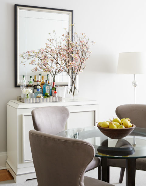
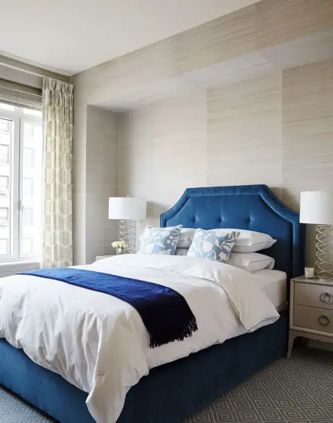
In the third example, a family asked the designers to completely change an apartment by means of an open, airy décor that matches their personality. Because of the two small children, the designers needed everything to be kid friendly. That meant easily cleanable, no hard corners and pieces that were also super durable. The customers and the designers settled on a very light, neutral base and brought in a single color to accent throughout the space — a deep teal.
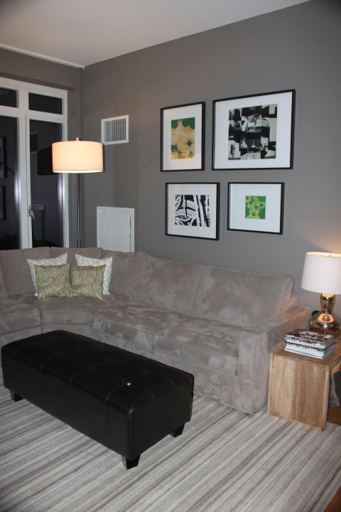
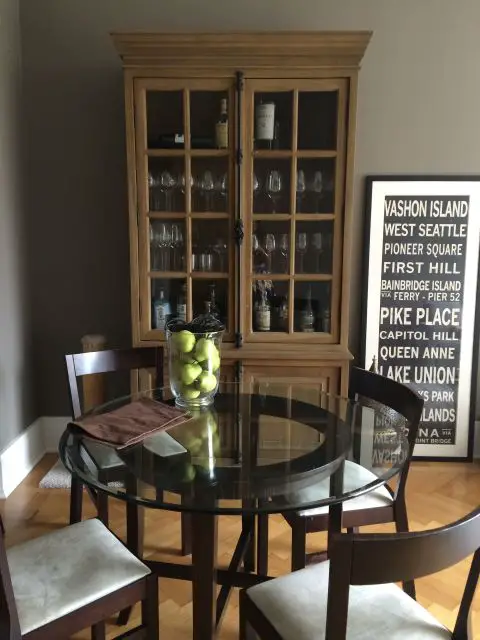
Apartment renovation ideas – neutral colors and a bit of blue
Sources: Wsj.com, Elledecor.com
